A Mountain Can Be an Interface
An independent game design and player experience analysis of Infuse Studio’s Spirit of the North 2


An independent game design and player experience analysis of Infuse Studio’s Spirit of the North 2
Some games are terribly worried you might get lost. They give you arrows. They give you glowing objective markers. They give you a minimap, a compass, a quest log, and occasionally an NPC who seems personally offended that you have not yet walked toward the enormous yellow icon hovering in the distance.
Spirit of the North 2 is quieter about it.
Instead, there is a mountain.
Or a ruin.
Or a strange opening between two rocks that makes you think, I wonder if I can get through there.
And usually, that is enough.
That was one of the things that interested me most while playing the game. Spirit of the North 2 does not eliminate traditional game systems, it has quests, combat, abilities, resources, puzzles, and progression, but some of its most effective guidance happens without much interface at all. The environment does the talking. A cliff tells you to be careful. A distant structure asks to be investigated. A narrow path tells you exactly how nervous you should be about the next thirty seconds.
Looking at the game through a UX and interaction design lens, I kept coming back to the same idea:
What if the world itself is part of the interface?
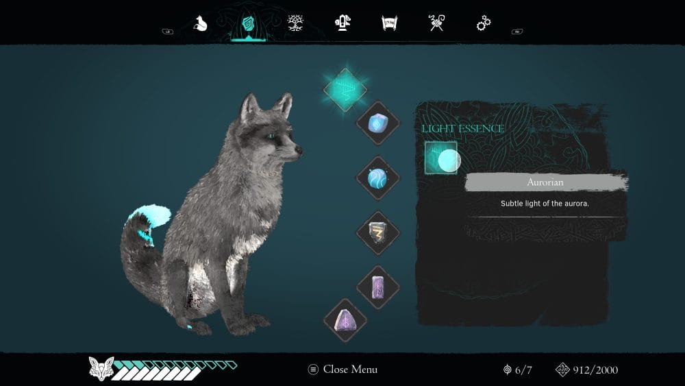
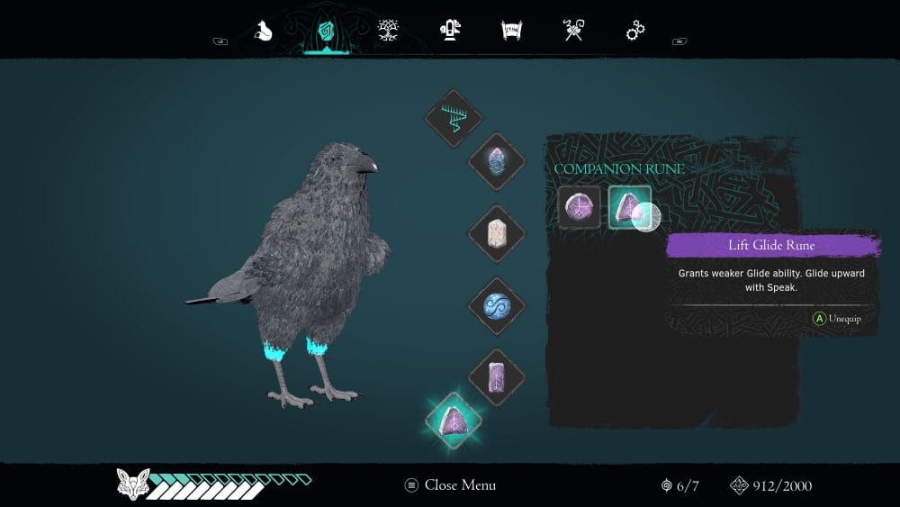
At its core, Spirit of the North 2 is about movement and exploration. You control a fox traveling through a large natural world alongside a raven. You run, climb, solve puzzles, cross ruins, collect resources, develop abilities, and occasionally fight things that are considerably less interested in peaceful exploration than you are. But the part I found most interesting was the simple act of noticing something.
Maybe there is a structure in the distance.
Maybe a path looks suspiciously deliberate.
Maybe the top of a hill seems reachable, and suddenly you are no longer thinking about the quest you were supposedly doing. You are thinking: Can I get up there?
That tiny question is one of the game's most effective UX tools. The interaction loop becomes something like:
notice → investigate → navigate → discover → repeat
Nothing particularly revolutionary is happening mechanically. What matters is the motivation. A waypoint says:
Go there.
A visually interesting landscape says:
Don't you want to know what's over there? Those are not the same thing. The second makes the player's movement feel self-directed, even when the environment has very deliberately been designed to pull attention in a particular direction. That is one of the game's smartest design lessons.
Good guidance does not always need to look like guidance. Lighting, elevation, architecture, movement, contrast, and composition can quietly perform jobs we usually assign to interface elements.
Sometimes a mountain is basically a button. It is just a very large button.
The environment is not only there to tell you where to go. Sometimes it is there to make sure you are fully aware that falling would be a terrible idea. There are cliffs, narrow bridges, steep mountains, lava, drops, and traversal sections where the game suddenly becomes much less relaxing than its beautiful landscapes initially suggest. I happen to dislike heights. So certain traversal sections produced a surprisingly physical reaction for me. And from a design perspective, that is fascinating. There was no monster chasing me. There was no giant warning sign flashing DANGER. The geometry itself communicated the risk. A narrow path over a huge drop already contains all the information the player needs. That is environmental communication at its simplest. The game does not have to explain why the situation is tense. Your brain has taken care of that before the tutorial designer has even opened Figma. It also creates a very different kind of suspense from combat.
Combat asks: Can I defeat this?
A dangerous landscape asks: Can I safely get through this?
That difference matters because the tension remains connected to exploration rather than interrupting it.
Combat in Spirit of the North 2 supports exploration rather than competing with it. Enemy encounters, puzzles, hazards, resources, and progression systems add friction and purpose to traversal, preventing the world from functioning as a purely visual space. They give the world a little resistance. Without objectives, a beautiful landscape can eventually become something closer to a digital nature documentary. Lovely, certainly. But mechanically passive. The combat and progression systems make sure you are interacting with the world rather than simply admiring it. And that distinction is important in exploration games. The best environments are not merely pretty. They give you reasons to touch them.
The animation of the fox and raven deserves more attention than it might initially seem to. In an exploration-heavy game, movement is constantly visible. You are watching the character run for hours. If the movement feels stiff, repetitive, or disconnected from the terrain, the game reminds you every few seconds that you are controlling a digital object. That means locomotion is not just animation. It is UX. That matters even more with an animal protagonist. Most players are not experts in fox behavior, but with the amount of animal content on social media, there is a good chance they have watched at least a few videos of foxes running, jumping, or reacting to their surroundings. That creates a basic expectation for how a fox should move. When the animation aligns with those expectations, the character feels more believable and more integrated into the world. A convincing fox does not need to explain itself. It does not need to tell us how it feels. Movement, posture, hesitation, companionship, and environmental context can do a surprising amount of emotional work. Which is probably fortunate. A talking fox would have made this a very different game!
The game's restrained atmosphere also changes how players pay attention. In a visually crowded environment, everything competes with everything else.
Icons.
Characters.
Text.
Effects.
Notifications.
Spirit of the North 2 often does the opposite. It gives you space. And when the world becomes quieter, smaller things become more noticeable. The absence of constant information becomes part of the information design. There is a useful UX principle hiding in there:
Reducing information can increase attention.
That sounds obvious when written down. It is considerably harder to practice when designing anything. There is a downside to building such an immersive, observational experience. Quiet games make bugs louder! Players have plenty of time to notice when something looks wrong.
The biggest lesson I took from Spirit of the North 2 is that its best moments happen when several systems are saying the same thing.
The environment provides direction.
The environment creates danger.
The environment tells stories.
The environment establishes mood.
The environment controls pacing.
That means the landscape is doing far more than sitting behind the gameplay looking attractive.
A few principles stood out to me:
Let the environment communicate before adding UI.
Players may already understand direction, danger, or opportunity from the space itself.
Use curiosity as motivation.
If the player genuinely wonders what is over there, you may not need to tell them to go there.
Traversal can create tension without combat.
Height, narrow paths, instability, and environmental hazards can make movement dramatic.
Animation is interaction design.
When movement occupies most of the player's time, movement quality becomes part of the user experience.
Not every successful emotion has to be pleasant.
Melancholy, loneliness, uncertainty, and vulnerability can be intentional design outcomes.
What stayed with me after playing Spirit of the North 2 was not a particular fight or puzzle. It was the feeling of moving through its world.
The fox.
The raven.
The ruins.
The cliffs.
The enormous empty landscapes.
All of them were doing something that we normally associate with interface design:
communicating with the player. And that is probably the part I find most interesting as an interaction designer. Game UX does not stop at menus, HUDs, buttons, prompts, and inventory screens.
Sometimes:
A mountain is an interface.
A cliff is a warning message.
A ruin is a navigation cue.
And sometimes the game's most effective instruction is not an arrow telling you where to go.It is simply something interesting on the horizon making you think: I wonder what's over there.